I attend a lot of meetings in my day to day work, and it amazes me how little people care about their own presentation templates. From what I’ve seen, many seem to think of their slide deck as an afterthought and not as important as they words they are speaking. As a visual designer (and someone who has to sit though a lot of presentations), I completely disagree. A PowerPoint slide deck should be visually engaging, used as a tool to draw the audience into the point the presenter is verbally trying to make. If content on the slides is distracting or conflicting, there’s a problem.
The lack of appreciation for good design and information flow that I’m seeing in the presentations that I sit through is alarming. It’s got so bad recently that I’m starting to think that there are some people who design their slide decks badly on purpose – after all, it’s certainly one way to spice up an otherwise boring corporate job. Not so good for career advancement, but it probably makes the days go by much faster, right?
Sounds like fun? Go for it! Here are 3 things you should definitely do if you want to create a really bad presentation template:
1. Ignore your corporate branding guidelines
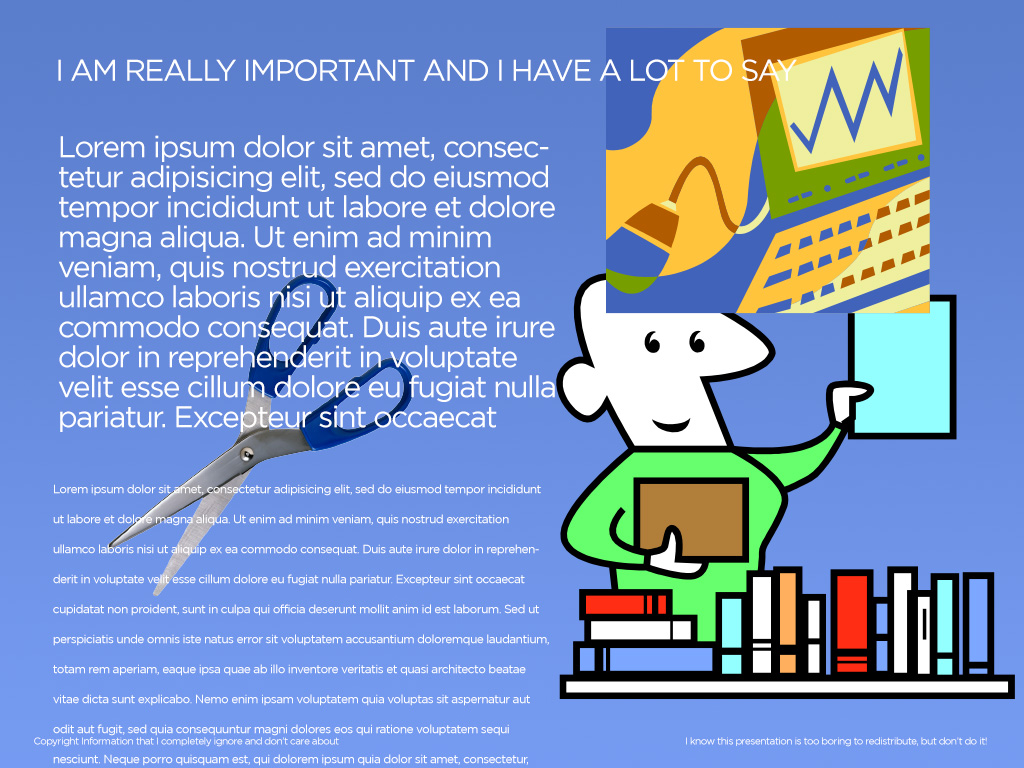
Ignoring corporate design guidelines with bad clip art – such a rookie move
Nothing says “I don’t care” more than a corporate PowerPoint deck that has been hacked and cut up to pieces with bad clip art and overlapping content. The last company I worked for spent millions of dollars on a high-end branding redesign, and the official PowerPoint templates they provided to employees were nothing short of stunning. But it took less than a week before I saw presentations that were “modified” to the presenters own tastes. Text and images spilled over the corporate logo, slide transitions didn’t match the style of the template, and colors used in custom charts and graphs were nowhere close to following the corporate branding guidelines. Not only does this make the presenter look bad, it reflects poorly on the company as a whole if the slide deck has a wide distribution.
2. Cram as much stuff onto each slide as possible
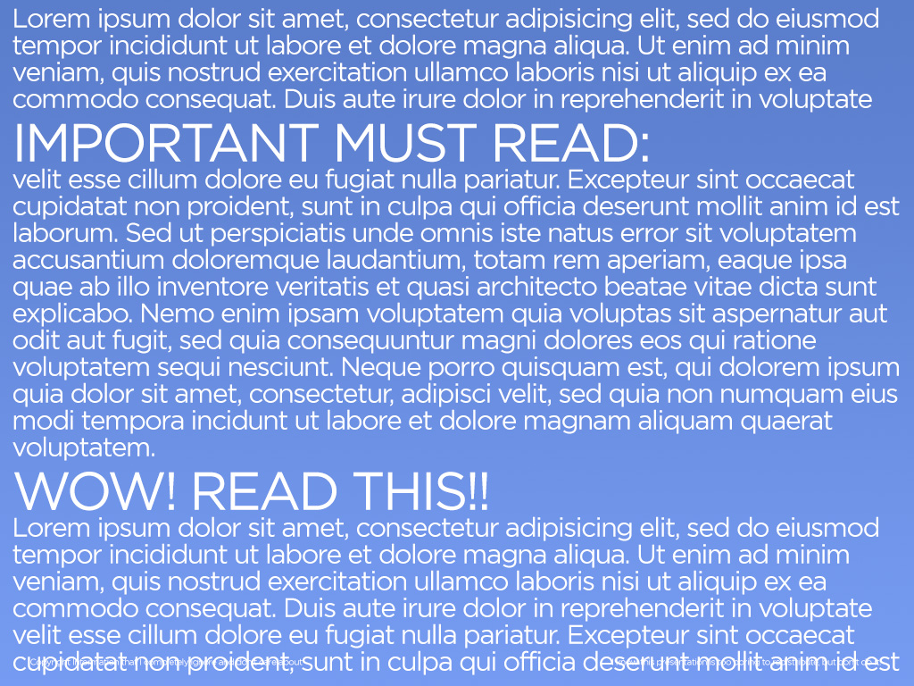
Too much information on one slide!
I always cringe when I see slides that are filled to the edges with content. This is bad, because one of two things are likely to happen. First, your audience will be reading your slide as you’re talking and will attempt to absorb your information on their own (completely ignoring what you are saying). Second, their eyes will glaze over from information overload, again completely ignoring what you are saying. I don’t know about you, but I always hate it when the presenter spends 30 minutes on one slide. Boooring!
3. Make your slides incomprehensible to understand without you being there to explain it all
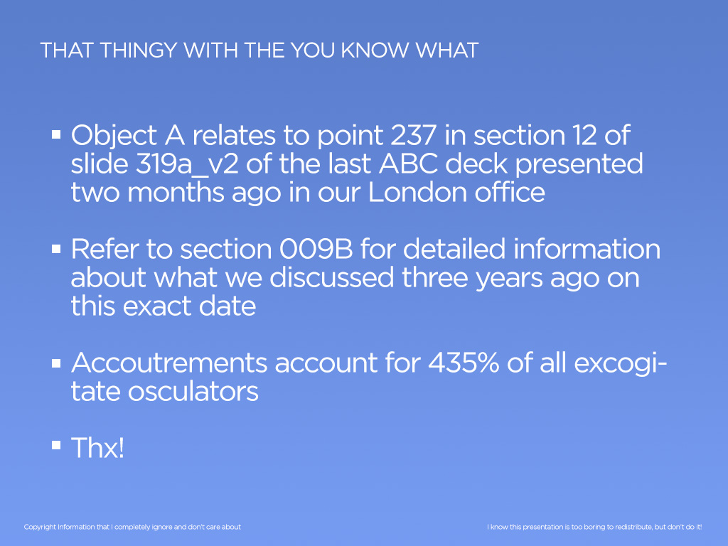
Huh? What did you say?
If the content in your slide deck is difficult to understand without you there to present it, you’ve failed. You should always design your presentation slides thinking about how someone would digest the information if it were emailed to them without any explanation. If your content doesn’t make sense on it’s own, it’s likely that your verbal presentation is disorganized and difficult to follow as well.
Conclusion
If you do any of the things I’ve listed above, you are guilty of producing terrible presentation templates (and perhaps having fun with your audience if you’re doing it on purpose). Don’t want to make bad presentation templates?
- Don’t do anything I’ve described above!
- Browse my large collection of premium PowerPoint templates and get inspired
Have some pride in the work that you do and the information you are presenting. Your audience will judge every aspect of your presentation, and thinking that “it doesn’t matter” is not going to do you and your career any favors.
No Responses Yet