
Of all the presentation themes that I’ve done over the years, this Purdue PowerPoint template just might be one of my favorites. It’s a 6-page slide deck with a large gold Purdue logo prominently displayed (loud and proud!) in a variety of locations. It’s versatile. Clean. And most importantly, it satisfied my itch to pay tribute to my favorite college football team of all time.
A detailed summary of this 6-slide Purdue PowerPoint template
As I’ve already mentioned, this Purdue University-themed slide deck is a 6-page “starting point” which will allow you to build out a stunning slide deck just the way you want it.
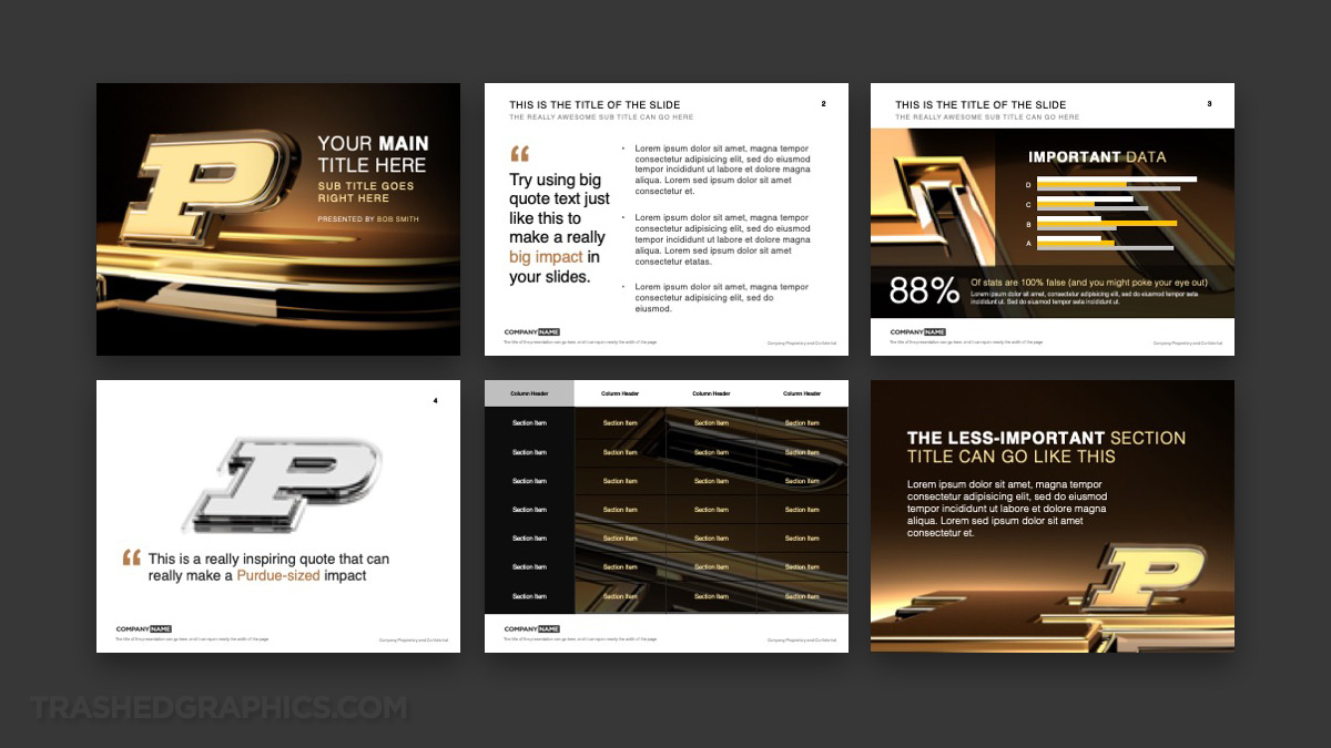

It’s important to note that all slides are highly customizable. All of the elements that you see (except for the logo renderings themselves) are layered elements that you can modify however you wish (or even remove). After all, nobody likes PowerPoint templates that don’t allow for personal modification!
The cover slide
The cover page of this deck features a very large gold and silver Purdue logo placed over a metallic gold surface. As a matter fact, that gold surface is actually another Purdue logo laid down horizontally. It was a nice way to add some detail and texture to the surface IMHO.
The background is a simple gradient fading from black to gold. I chose to keep the background on all slides as simple as possible, because it allows for easier placement of text and other graphics.
The text slide
Easily the simplest slide in this entire deck, the text slide was purposely left clean and white in order for it to display content as clearly as possible.
There is a area dedicated for a secondary graphic (or a quote) on the left, but you can eliminate that space if you deem it to be unnecessary. If so, just pull the entire text block over to extend the entire width of the slide.
The data slide
Slides that show a collection of data in the form of charts and graphs can be very difficult to create “generic” templates for (it’s why my editable org chart template was so challenging). Because of that, I decided to place some simple data-specific graphic elements over top of the gold 3-D Purdue logo in a somewhat simplified manner.
Because I understand that nearly everyone who uses this slide will need to modify it in some way, I made sure to leave all of these elements 100% customizable. The entire page is built with graphical blocks, and you can rearrange it however you like.
Section title pages
Section title pages are extremely important when it comes to having a clean and easy to follow slide deck. That’s why I created two.
The first version features a large transparent glass 3-D Purdue logo laid down over a white surface. The space below it is reserved for a large quote or text block.
The second version features a metallic gold logo element placed in the bottom right hand corner. The entire slide is dark and heavy, which allows for the text content to be placed cleanly over top of it.
The table slide
In an effort to keep things as simple as possible (are you sensing a pattern here?), the table slide features a transparent black 4-column table over top of a black and gold logo element.
Again, just like most of the elements in this entire Purdue PowerPoint template, this table is highly customizable and you can modify it however you wish. You can change colors, add and remove rows and columns, etc.
What makes this template so great?
Even before sitting down and starting the design for this Purdue PPT theme, I knew that it had to feature three things:
1. Heavy metallic textures
Those of you who know me understand my love of using heavy metallic textures in my 3d renderings and templates (even my Cloud Computing PowerPoint template has a heavy metallic theme). I spent 20 years in the corporate world making graphics for presentations of all kinds, and if there’s one thing that I learned, it’s that metallic textures and glossy services get lots of attention.
These metallic textures are something that I include in all of my PowerPoint templates. Not to toot my own horn or anything, but I especially liked the textures I used in my Supplier Chain Management PPT template.
2. Loads of contrast
Contrast is extremely important as well. Especially when it comes to presentation themes! After all, the projectors and video screens in most conference rooms these days are of very low quality, and there’s nothing more embarrassing than showing up with a slide deck that is difficult to read.
Contrast will allow your audience to scan the pages quickly and easily, and this Purdue-themed slide deck has loads of it. It’s basically an “grown up” version my obnoxiously-colored brain PowerPoint template.
3. Flexibility
Flexibility is important! After all, themes such as this are designed to be a basic framework for an unlimited number of uses. As a PowerPoint designer, it’s important for me to understand that I really have no idea how my templates going to be used. Therefore, this slide deck was built to be taken apart, modified, and rebuilt per your needs.
No Responses Yet