
Sales topics and slide decks go together like peanut butter and jelly, so it’s no surprise that I tend to fall back on this theme pretty often. The problem is that it’s not so easy to create a generic sales PowerPoint template design that is useful to many, so it’s usually a slow process to create something practical for those of you out there who are doing the sales grind.
Retail sales PowerPoint Template
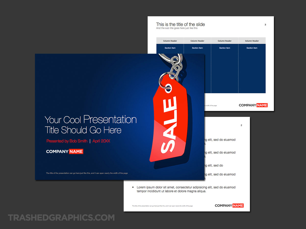
For this sales-based template, I decided to go really simple and use a lot of bright color to create interest. I started out by creating a vivid blue background texture for the cover slide, and then I experimented by placing a variety of sales tags over top of it just to see what would happen.
Fully editable Microsoft Powerpoint presentation template. Includes cover, text, and table pages. Blue and red sale tag theme.

Long story short, I really like the way that this particular bright red SALE tag popped off the background (in a huge way). Yes, it’s bright and contrasty – but not too loud and obnoxious. Kind of like a good sales pitch should be, right? Ha!
The interior slides are a bit less contrasty, but I decided to carry over some of that vivid blue into the sample table. I realize that some people don’t like dark background colors for tables, so if it’s not really your thing you can mix and match elements from any other of my other PowerPoint templates to find the combination that you like.
It will also help if your logo is red! I do recommend, however, that you use an all-white version of your company logo on the cover page and a gray version on the interior slides. Anything else (besides) red might clash with this theme.
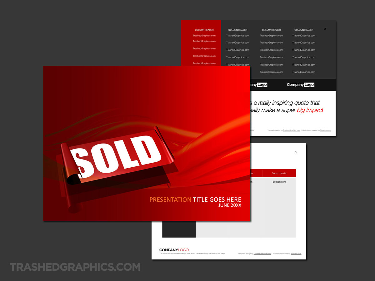
How about a template with a giant SOLD sticker on the cover?
I’m not a salesman (seriously, I couldn’t sell a glass of ice water to someone dying of thirst in the desert), but I’m bright enough to know that slapping a “SOLD” sticker on something is a feeling like no other.
Fully editable Microsoft Powerpoint presentation template. Includes cover, text, and table pages. Dark red sold sticker theme.
I created a series of 3d renderings featuring “sold” stickers a long time ago, and it only seemed fitting to create a sales-based PowerPoint template out of one of them. This particular template is much bolder than the other two in this post. It features a highly versatile table slide with space for corporate logos (presumably so you can brag about the sales you’ve made).
Another version of the sales tag theme
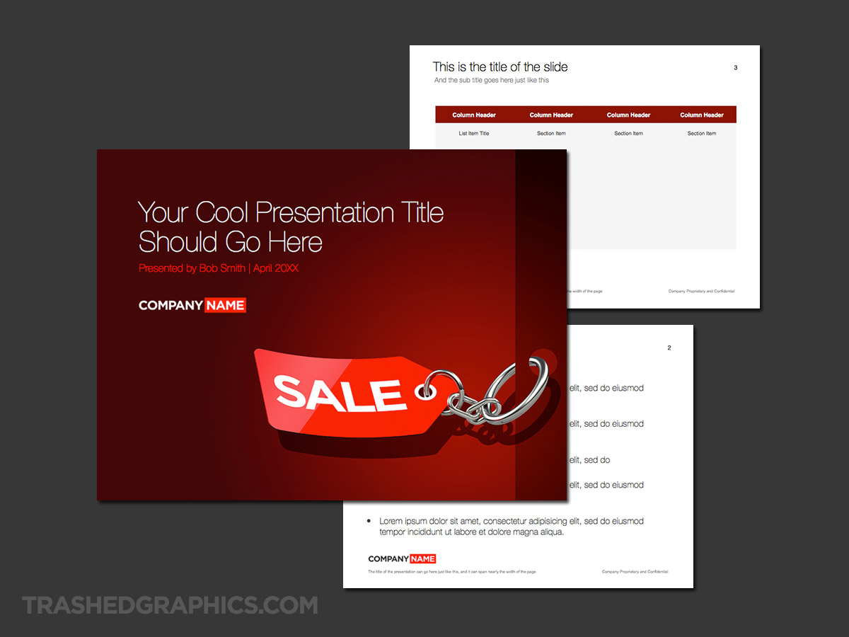
I hate to admit that the first template I posted above just so happened to be one of my “happy accident” templates. In other words, I was just sort of experiencing with different objects over a bright blue background until I found something that I liked. That red SALE tag is a pretty cool element and I wanted to see if I could use it in other layouts. Because of how well I thought it worked as a “sales” PowerPoint template, I decided to try it again.
Fully editable Microsoft Powerpoint presentation template. Includes cover, text, and table pages. Dark red sale tag theme.
This template is very similar to that other one, with the main differences being the position of the tag, and the red color scheme vs. the blue. I also created a narrow sidebar along the right edge of the color slide with a hole in it that the tag could attach to, which gives it a bit more visual interest. I also think that the horizontal layout of the tag is better for longer presentation titles – you can use nearly the entire width of the slide if you need to.
I also experimented with a bunch of different color treatments on the sample table slide. In the blue template at the top of this post, I used the dark blue from the cover slide as the fill color for the table. But that doesn’t work so well with the red color in this template. Red is very harsh, and it’s not a good background color when there’s going to be a lot of text placed over top. Because of that, I decided to keep things simple and make the body of that table a lighter gray. Your content will be much easier to read.
No Responses Yet