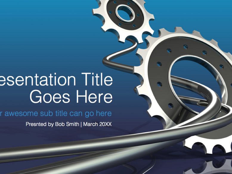
I’m starting to get a lot of requests for widescreen PowerPoint templates (such as the basic 16:9 theme I created earlier), so here’s an engineering powerpoint template theme featuring thick networking cables and gears. Much like the Facebook design I uploaded a while back, this slide deck features four slides with a variety of fully editable charts and graphs that you can modify however you wish. The 3d renderings of the gears were created by me (my Norebbo brand, more specifically), which allowed me to illustrate different views to use as complimentary graphics for the circular charts and graphs in the interior slides. You don’t have to use those gears on the inner pages if you think they’re too much, but I think they help to tie this theme together from page to page.
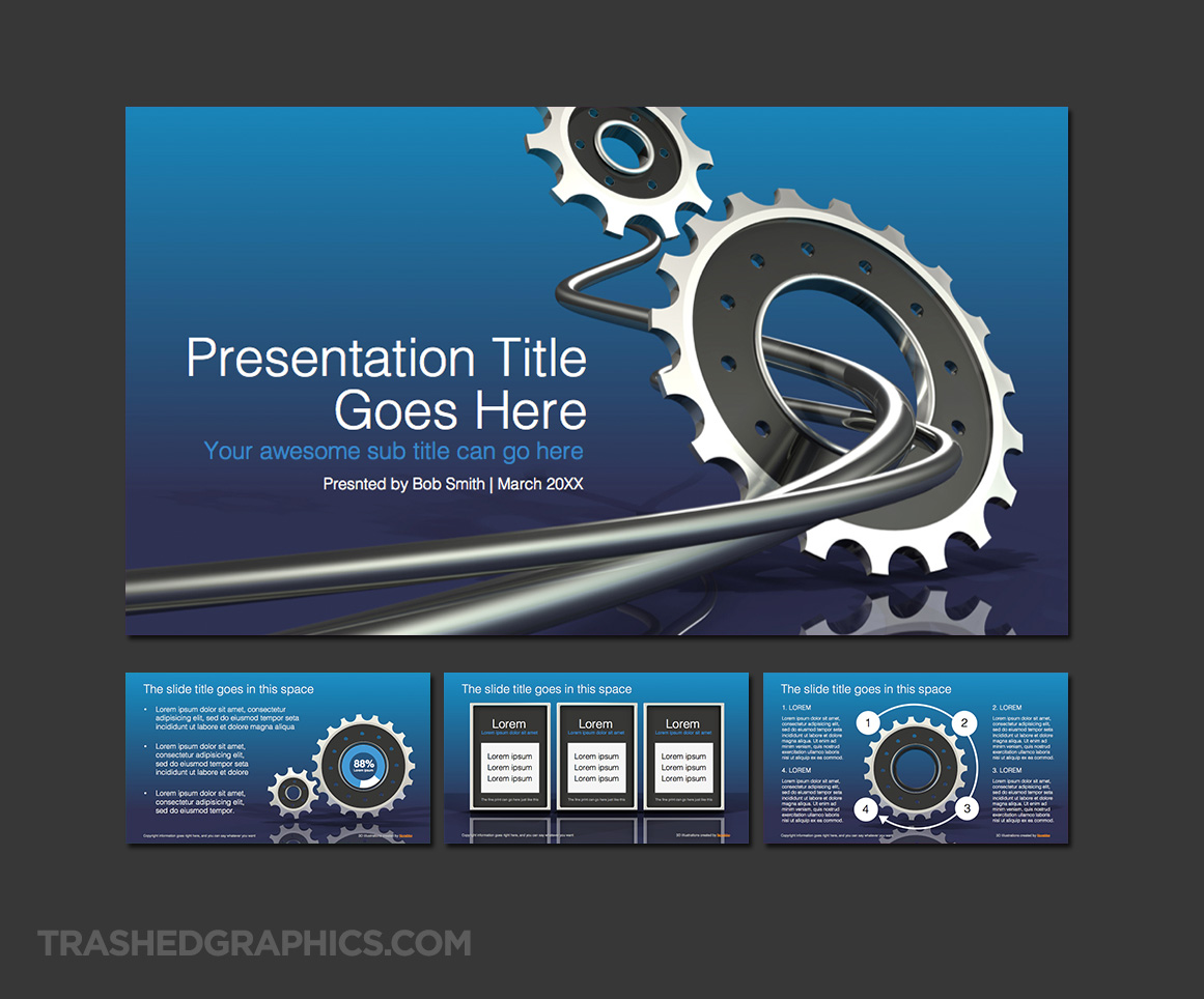
16:9 widescreen design and engineering PowerPoint template with four slides

I was debating whether or not to make this engineering powerpoint template silver and gray, but I’ve found from experience that the best PowerPoint color is blue. It’s a very calming and respected color in many cultures, and it tends to fit in well with many different corporate design languages. I did take a risk by using such a strong gradient for the background, but I thought that it would be ok and a nice compliment to the bold 3d illustrations of the cables and gears.
Anyway, I think a 16:9 widescreen format is perfect for presentation topics related to engineering and and design. These kinds of presentations often require the inclusion of large images and diagrams, so having more room to position that stuff always helps. I’ve often discussed my dislike (hatred) for seeing PowerPoint slides crammed edge to edge with overlapping pictures and text (my guide on how to create a terrible PowerPoint presentation sums up my thoughts perfectly), so hopefully these wider layouts will eliminate some of that problem.
One thing I didn’t include in this template is an all-white page. I personally don’t care for dark-colored slides, so I’d actually recommend that you create one more master page that doesn’t include the blue gradient background. You can keep those richer-looking pages for section title pages, and use all white backgrounds for the main content of of your presentation if you prefer. That would actually look pretty cool, IMHO.
No Responses Yet