When I wrote my last post about the commercial aviation presentation theme, I mentioned that I have been working on a lot of slide decks recently – and there have been a handful of those that I didn’t like very much. This is another one that I wasn’t too happy with.
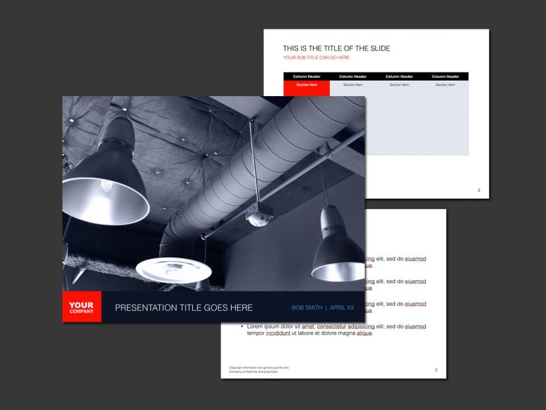
The photo on the cover slide was one that I took with my smartphone while in a nicely designed office space recently, and I have actually been able to use photos from this series in a variety of other projects. I even used them in an entire series of PowerPoint templates that turned out kind of cool, and I thought I had a good thing going with this one. But the end result is not quite what I had in mind.
I think the thing that bugs me the most about this particular Keynote template is the fact that I didn’t take the time to edit the cover photo properly so that the lights aren’t so distracting. When looking at that slide, all I notice are the three white discs that are the interior of the lights – and I find them highly annoying. I should have spent some time to mask those out in Photoshop. I also don’t care for the thickness of the title bar at the bottom. A thinner, slightly more transparent overlay would have worked better here.
Oh well. I could have gone back and fixed those issues, but I created so many other better presentation templates based on this photo so I just let this template go.


No Responses Yet