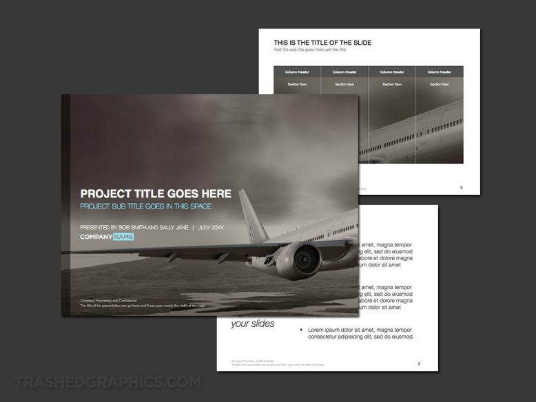
A few months ago I uploaded a commercial aerospace-themed presentation template featuring a photo-realistic illustration of a large airliner taking off from a nondescript airport. Overall, I was happy with the way it turned out, but just as I mentioned in my last post, I am not a fan of bright colors (as I discussed in my rant about the color gray many years ago). Yeah, call me a gloomy designer (or whatever else you’d like), but it was really bugging me and I thought I could do better. I also didn’t necessarily care for the wavy pattern on the bottom portion of the cover slide, so it has been somewhat of a high priority for me to redo it in a way that I preferred.
So here it is. It’s basically the same template as the other one, but void of color and swoopy shapes. It’s also a bit more the on the artistic side of things, since I placed the bulk of the aircraft off of the edge of the screen. Doing so make a nice visual “void” to place the title text into. Much better! To me anyway…

I also tightened up the typography a bit and used a heaver font, which I think helps to create nice contrast against the dark monochrome background. The heavier font is a good match for the tone of the commercial airline industry in my opinion, as conveying a theme of “strength” and “stability” in the visual design language helps in the credibility department.
If you’re a fan of color, you’re probably not going to like this one as much. But if you’re handy it Photoshop, it wouldn’t be difficult to tint the images with a bit more saturation of the color of your choice. Like I have always been saying: the more you can customize these templates and make them your own, the better!
No Responses Yet