I recently created a TON of UX design presentation template designs, and there are a lot of leftover designs that I have no idea what to do with. One reason why I have so many is that I always tend to create several templates to use on a rotating basis for various projects. It’s a smart idea for anyone who gives presentations frequently!
Rotating presentation themes keeps your content looking fresh and your audience interested (especially if it’s the same audience over and over again). The other reason is that I simply enjoy creating presentation templates. I’ve created a HUGE collection PowerPoint templates for fun, so yeah – I guess you can call it a sickness.
Anyway, variations of these PPT themes are very easy for me to produce, and I find myself tweaking forever and telling myself to stop and move on.
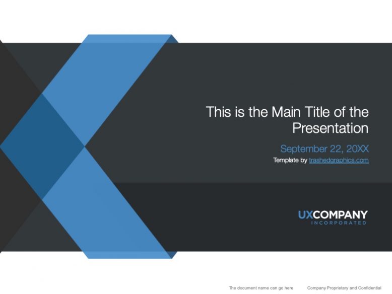
Flat blue and gray UX design presentation template
This blue and gray UX design presentation template is fully editable, so you’ll be able to move things around and adjust the design however you wish. It’s very simple, and the premise of the design is that the X from “UX” becomes sort of an abstract graphic element and part of the visual structure of the slide.
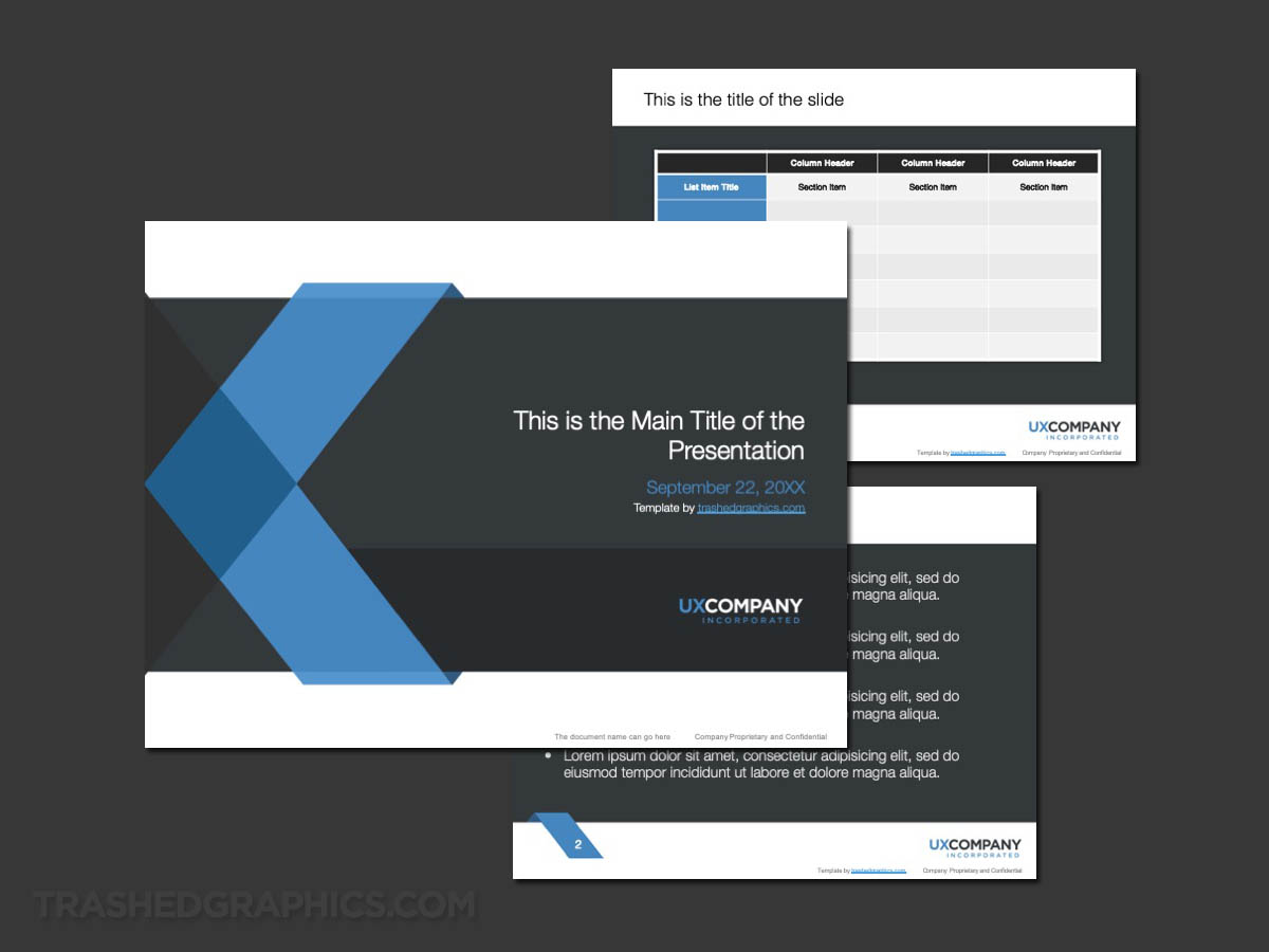
3-page blue and white UX theme template.

Those of you with eagle eyes will know that the font that I used for the “UX” on these slides is the same that I used on a Photoshop UX design presentation slide concept many years ago. It’s also very similar to a blue UX-themed cover page I created shortly thereafter.
One of the things I especially like about this template is that it’s abstract enough to use even if you don’t need to have a User Experience (UX) theme.
Blue and orange User Experience template
I completely admit that I’m a total perfectionist when it comes to most things in life, and it’s especially bad when it comes to design work. Even if I can immediately create something I like right from the get-go, it doesn’t take long for me to start looking at it like there’s something wrong with it. That’s how this second variation of my UX presentation design template series came to be:
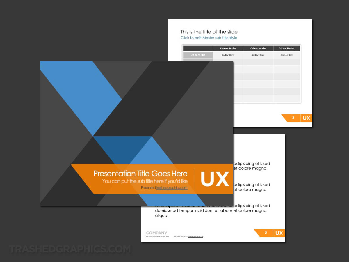
3-page blue and gray UX theme template – with a splash of orange.
As you can see, it uses the exact same “X” design element from the blue and white template above. However, I was starting to think that it need a bit more color, so I added orange into the mix. To be honest, I think it worked. Somewhat.
The problem was that I quickly realized that without any white showing through, the cover slide was too dark for my tastes. Oh well. On to the next one…
Bold User Experience presentation template
Okay, now we’re getting into the rough stuff. The third UX design presentation template that I created in this style features a large version of the overlapping “X” element that I used for the previous two layouts.
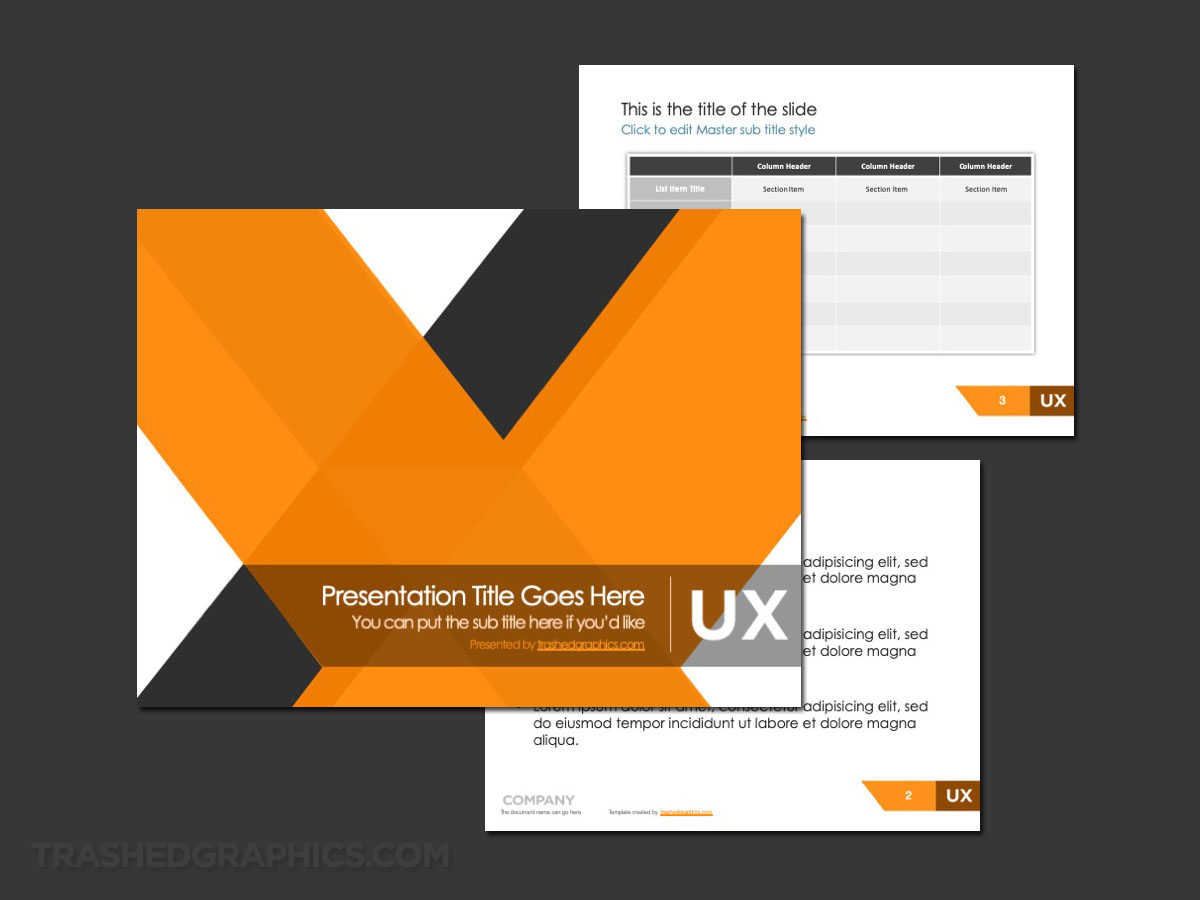
Orange and gray UX PPT template – with a huge honkin’ “X”.
Unfortunately, I feel as if I was a bit too heavy handed with this one (in regards to both color and design). It’s not that I totally hate it – it’s just that part of me thinks that the X on the cover slide is so large that it doesn’t even look like an actual X anymore.
The content and table slides are direct carryovers from the previous templates, so I guess you can think of this one as a bold version of the three so far.


No Responses Yet