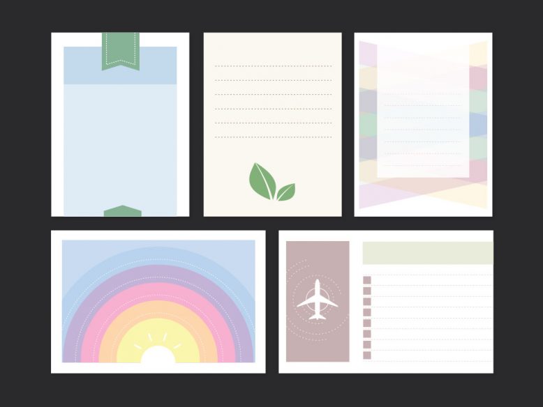
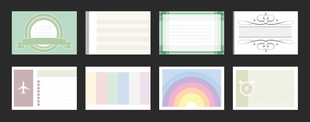
OK. Now I’m getting totally out of my element. To be honest, never in a million years would I have thought that I would ever design a set of scrapbook cards, but here we are. Yeah, I like to consider myself as the manliest of men, but I had to dig deep to find any estrogen that I had inside of me to get this set done. Should I be worried that I actually found some?
Anyway, this was a project that I worked on several years ago. It was my sister who had asked me to create a set of scrapbook cards for her as a Christmas gift, and what you see here is the result. Luckily I had been watching her do scrapbook stuff for years, so I was no stranger to the idea of scrapbooking and the kind of things that she needs on a daily basis.
A brief summary of this set of 24 cards
Starting out, I honestly had no idea how many I was going to produce. The only guidance that my sister had given me was that she needed them to be in a 4:3 ratio – both horizontal and vertical.
She also suggested that I create vector versions so that she could go in and edit elements herself. Maybe that was her way of telling me that she wasn’t expecting anything useful from me? I’m not totally sure, but I do understand it since I’m far more comfortable illustrating guy stuff such as automotive brake rotor drawings and Super User logos.
Since scrapbook cards can be used for a wide variety of uses, I decided to stick with a very simple color palette. As a visual designer who spent a lot of time doing PowerPoint presentation design, I know that it’s the content (and not the container) which is what’s most important.
Pastel colors are generally safe when it comes to doing generic design work. This entire set features a set of approximately 30 colors in the same general hue and saturation category, which to me, seems like it would work in a variety of different scrapbooking situations.
| Basic Set | Premium Set | |
|---|---|---|
| Number of cards | 24 | 24 |
| Size of each card | 1024x768 | Unlimited (scalable to any size) |
| Format(s) | .jpg | .jpg, .eps, .ai |
| Editable |  |  |
 |  |
My design theme for this set scrapbook cards
Just as how I cautiously approached the color palette, I knew that keeping the design elements simple and basic would be best in the long run. It’s not like I was creating a car illustration or anything, and I didn’t have to worry about making everything look as perfect and final as possible.
After years of watching my sister worked so hard on her projects, I knew right from the beginning that a good set of scrapbook cards is defined as being simple and flexible. She modifies the snot out of all her design elements, cutting and pasting things into incredible combinations that I could never come up with myself.
Therefore, I felt it was important to stay away from complex shapes (like, for example, the shapes that I used in my vector line background illustration). I also wanted to stay away from complex design elements such as transparency and drop shadow. All of that stuff just gets in the way during scrapbooking anyway, so simple is best.
Basically, my entire goal was to create a set of scrapbooking cards which were:
- Designed to be cut up and pasted together with other design elements
- Designed to give inspiration
It was actually the second point that was the most important. Of course making nice-looking cards was high on my priority list, but I know very well as a visual designer that sometimes getting “stuck” happens. No matter how creative we may be feeling, there will always come a time when we just need a little extra boost of inspiration from something in our immediate surroundings.
By giving my sister 24 different cards to work and play with, my hope was that she might see something in one of them which sparked an idea for something else. She could then take that idea and build something completely on her own without using any of these cards at all. And I’m totally OK with that.
As a matter of fact, this sort of “almost finished” design philosophy” works great for other kinds of templates as well (such as my smart TV UI templates). Creating good design doesn’t always mean having to create a polished finished product.
How to edit these cards
As you see in the table above, I’m offering two versions. My thinking is that while most people could easily get away with using the free versions, there will be a handful of folks out there who need maximum flexibility and would like to do some editing themselves. Here’s how to edit and work with both:
- The Basic set: All cards are 1024 x 768 (approximately) In JPG format. While not completely editable on their own, they are indeed high-resolution enough for you to import them into your favorite graphics editing program and make minor changes.
- The Premium set: In order to edit the cards in the premium site, you’re going to need a graphics editing program such as Adobe illustrator or Affinity Designer. These files are completely editable with every element on their own layer. Not only that, you can scale and resize things however you please. You can also easily change colors.
What else can scrapbooking cards be used for?
It occurred to me as I was creating this entire set of scrapbook cards that there’s so much more that these could be used for (other than scrapbooking). As I said, the colors and design are simple enough to be applicable for many different situations. These are the ideas that come to my mind right off the top of my head:
- Invitations – more specifically, I’m thinking something along the lines of birthday party invitations due to how light and colorful all of these are. As a matter of fact, any type of event needing an invitation which looks bright and colorful would work. Think graduations, retirement parties, etc.
- Business cards – remember the set of generic business card templates that I created several years ago? With just a little bit of work and reformatting, I’m sure I could take some of these scrapbook cards and transform them into a really stylish business card of some kind.


No Responses Yet